
Level Access, 2022
Level Access: Design Evaluations
From a blank-slate UX research initiative to shipping an entirely new accessibility product for design teams.
ROLE
Product Design Intern
WHEN
05.2021 - 08.2021
OUTCOME
Net-new product shipped 2022
METHODS + TOOLS
Generative Interviews
•
Competitive Analysis
•
Usability Testing
•
User Interface Design
•
Figma
Overview
How do you create a product for an entirely new user group?
Essential Accessibility (now Level Access) is a leading digital accessibility platform. At the time, their product suite was focused almost entirely on developers, helping engineering teams audit code against WCAG standards. There was nothing for design teams: the professionals making foundational decisions about how interfaces look, feel, and behave long before a line of code is written.
I joined as a UX research intern in summer 2021 with an open mandate: explore whether eA could meaningfully expand its product offerings toward designers. This was a bluesky initiative with no predefined scope, no existing user data, and no product direction. My job was to figure out whether there was a real problem worth solving, and if so, what solving it might look like.
The Problem Space
What does the current accessible design landscape look like?
In most organizations, accessibility is treated as a compliance step at the end of the development process, after designs are finalized and often after code was written. Designers were largely left out. The result was a costly cycle: issues caught late, expensive rework, strained cross-functional relationships, and products that still launched with barriers for disabled users.
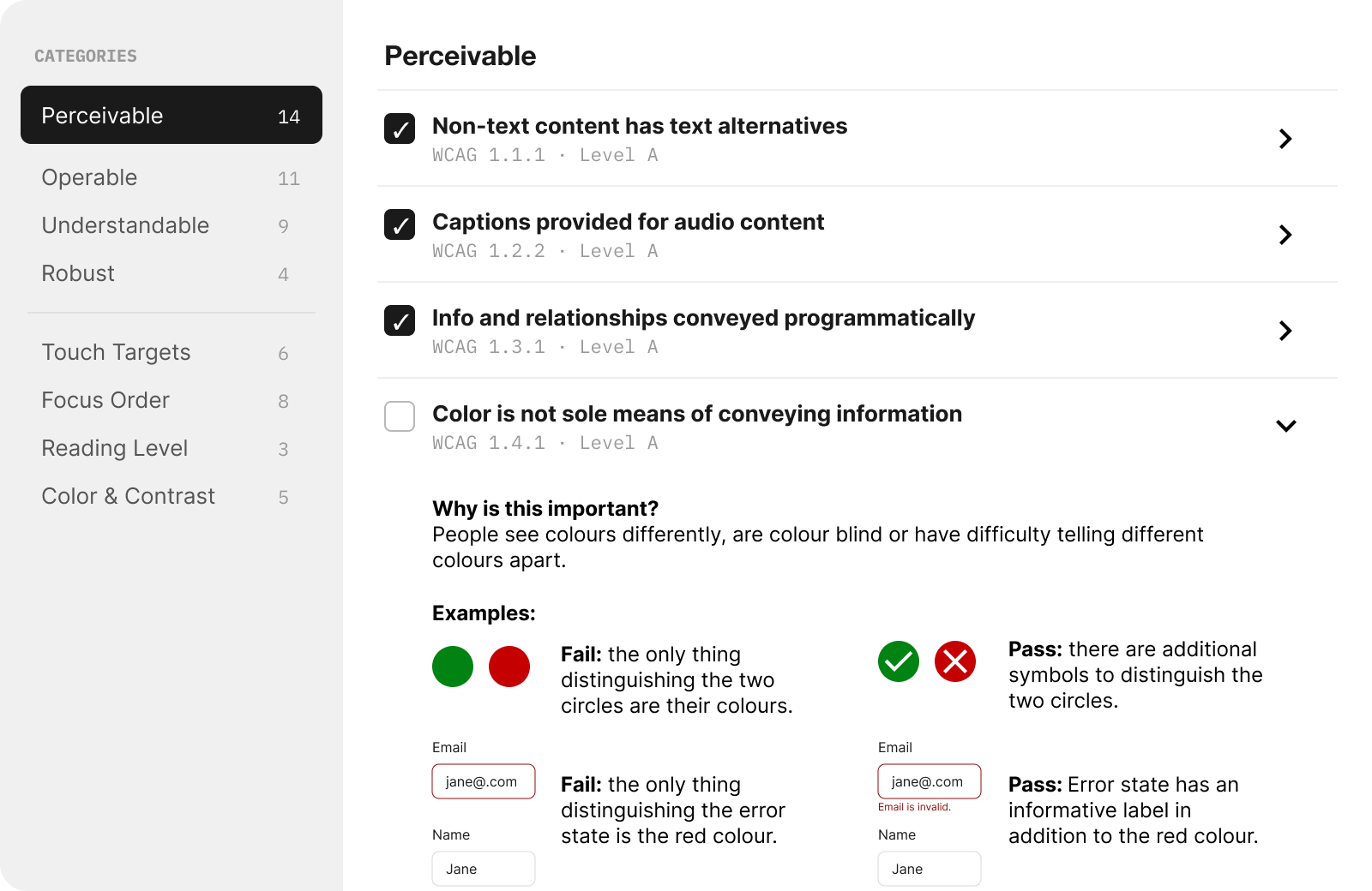
The tooling ecosystem reflected this. Existing design accessibility tools were dominated by colour contrast checker plugins and static WCAG checklists. But accessibility in design is far more expansive than colour contrast, including focus order, touch target sizing, reading level, motion sensitivity, cognitive load, error handling, and much more. The gap between what tools offered and what designers actually needed was enormous.
Design for accessibility is self-taught, limited, and almost always considered someone else's job.
At larger organizations like major banks with dedicated accessibility compliance teams, this dysfunction took a vivid form. In one case, a bank's entire digital division had a team of just two accessibility specialists supporting dozens of designers. These specialists were completely siloed. Designers would throw their work "over the fence" to compliance reviewers, who would annotate and throw it back, with no shared process, shared vocabulary, or real collaboration. Remediation was reactive, and everyone was frustrated.
Competitive Landscape:
Existing tooling was dominated by two categories: Figma plugins checking colour contrast, and static WCAG checklists. Colour contrast is one of dozens of accessibility considerations in visual design, but it had the most tooling, partly because it's the most legible and easiest to automate. Everything else: focus management, interaction design, content structure, touch targets, error states, etc were largely unaddressed. That was both a gap and an opportunity.
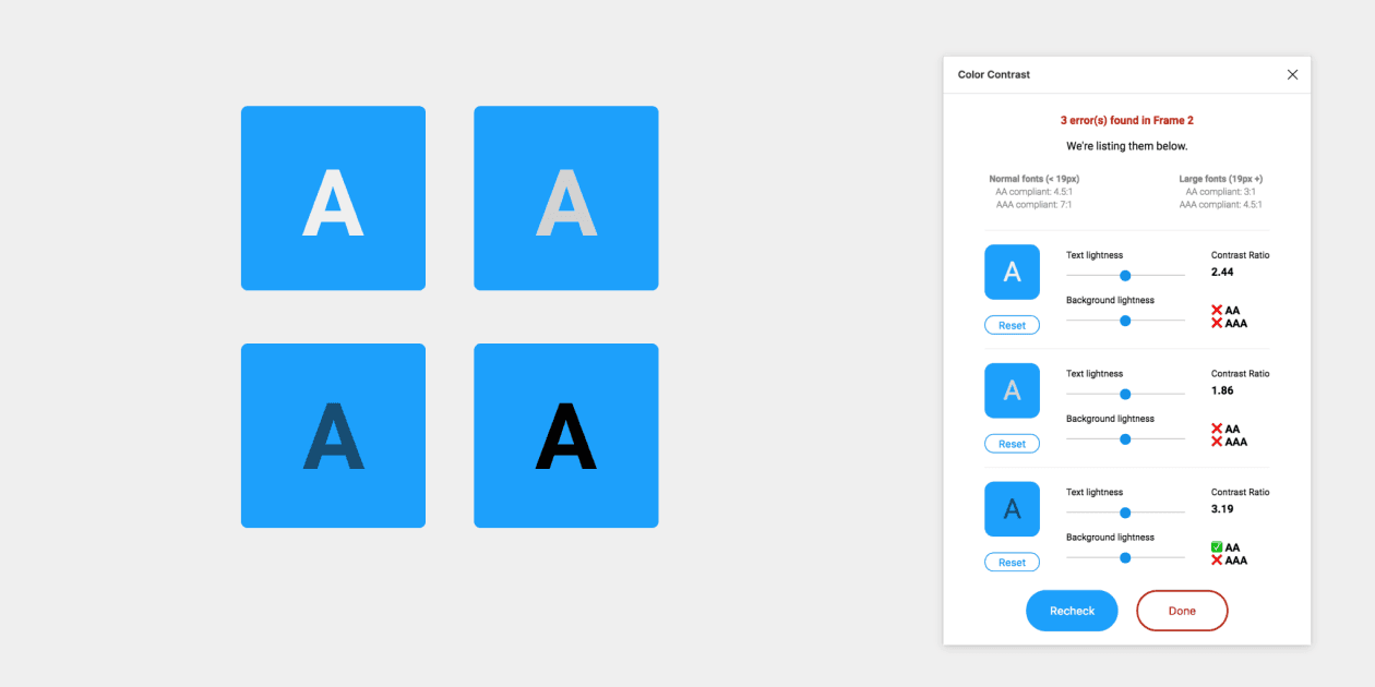
Most Figma plug-ins such as Able only check colour-contrast.
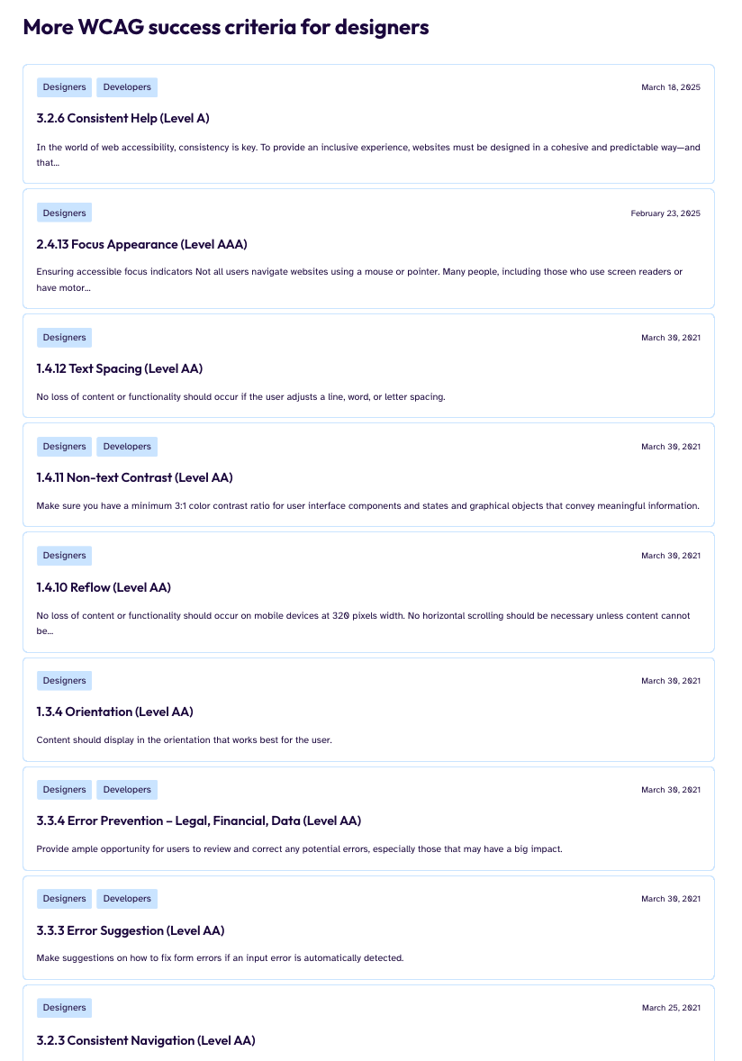
But WCAG success criteria for designers go way, way beyond colour contrast.
User Research: 30 interviews over two months
How do designers and organizations actually do accessibility?
I recruited deliberately across experience levels and organizational contexts because I wanted to know whether the accessibility problem looked different at different scales and career stages. I interviewed:
Junior designers & interns
Mid-level ICs
Senior ICs
UX managers
Creative/Design Directors
In-house teams
Agencies/Studios
Large enterprises
Early-stage startups
Insights:
Accessibility knowledge is almost entirely self-taught
Designers who knew anything about accessibility had learned it on their own time, through personal initiative. It was rarely taught in design programs, rarely included in onboarding, and rarely mandated by employers. Knowledge was patchy and miscalibrated, with a heavy emphasis on color contrast and almost nothing else.
Accessibility is seen as a developer and/or QA responsibility
Many designers had internalized that accessibility implementation was a code concern. Even designers who cared about the topic were uncertain about their specific responsibilities, a belief structurally reinforced by how most organizations set up their workflows. Accessibility advocates were overwhelmingly software developers, and checks happened at the software QA phase
Education tools alone are insufficient and disconnected from work
Early concept testing revealed that purely educational tools required designers to step outside their workflow, learn principles in the abstract and in their own time, and then apply them independently. Many current educational tools lack an empathy and storytelling element, and instead present long lists of guidelines.
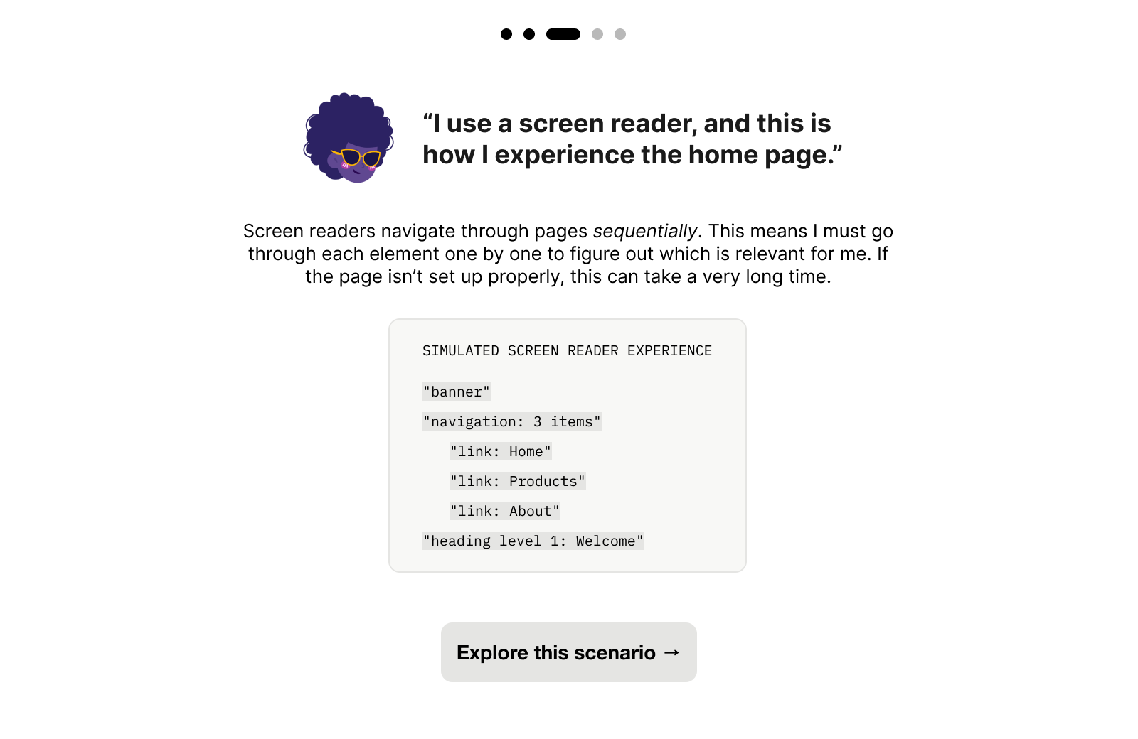
Evaluation during the design process is the opportunity
What resonated most was evaluating actual designs — real work in progress — with contextual guidance provided in the moment. Rather than abstract learning, designers wanted to be shown, while looking at a real screen, what issues existed and why they mattered.
Concept Development & Validation
How do we build an accessibility tool that fits into a range of design processes?
"The tool needs to feel like a natural design tool, not a legal checklist."
Based on my research synthesis, I explored three product directions. I built medium-fidelity prototypes of each direction in Figma and ran five moderated concept walkthroughs with participants from my research cohort. These were less formal usability tests and more concept probes. I was watching for comprehension, motivation, and perceived usefulness.
More comprehensive checklist
A more thorough version of what already existed, such as focus order, touch targets, reading level, and other criteria that existing tools ignored. It was more comprehensive than anything on the market. Giving users context on why the rule exists, and example-based guidance was an important aspect of this concept.
Insights:
"The examples are great, but all of this is a lot to deal with..."
Participants recognized it as the most thorough option, but described it as something they'd use “because they had to, not because they wanted to.” Two participants compared it to existing audit tools they already avoided.
The comprehensiveness that made it strong in concept made it feel like compliance work in practice.
Empathy narrative modules
An educational experience that walked designers through how (for example) a blind user would encounter certain digital experiences in order to build foundational intuition and empathy. However, it was more of an educational module rather than a product/tool within the design process.
Insights:
"This is super cool! But when I think about it, I’d probably wouldn’t take time out of my work day to look at this."
The empathy modules sparked interest, and this was the most positively received concept. Participants liked the screen reader simulation and said it shifted how they thought about accessibility. But when asked where it fit in their workflow, most placed it in onboarding or learning contexts, not active design work.
Participants realized that they wouldn’t reach for this tool mid-project — and so they would never look at it at all.
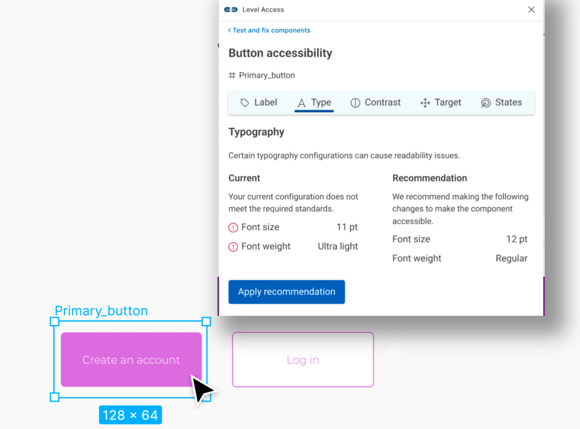
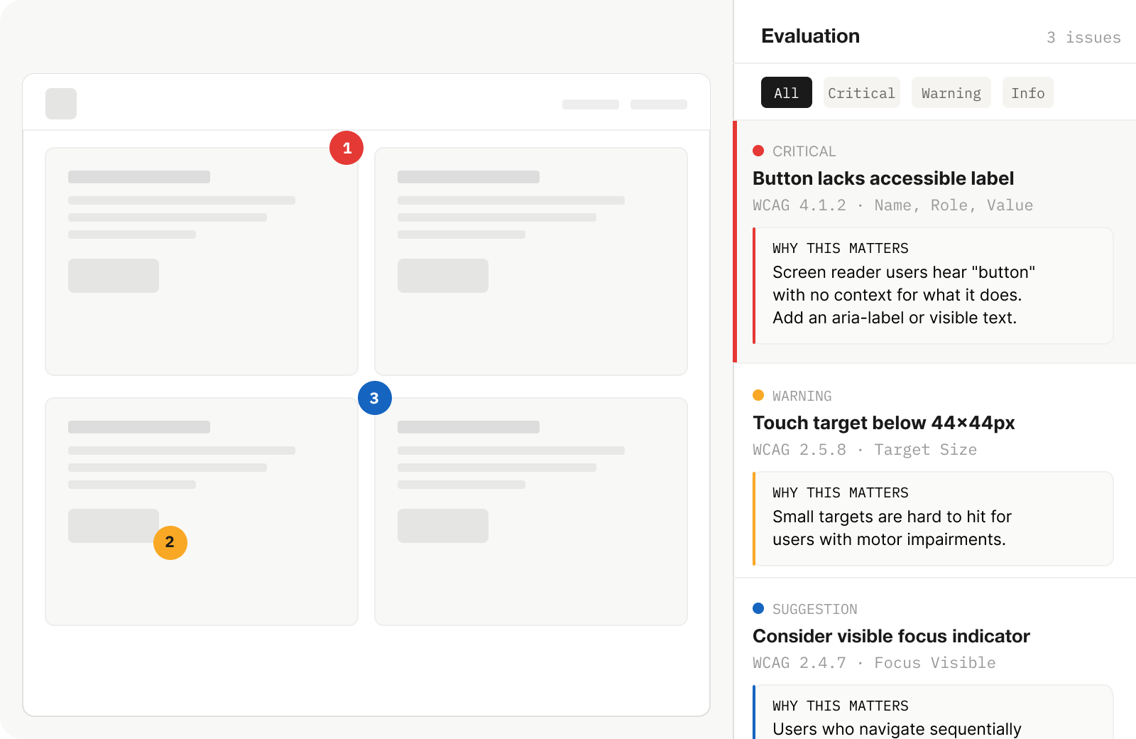
Framework for in-context automated and manual evaluations
Contextual accessibility feedback layered directly onto the designer's work in progress, assessing real components against WCAG 2.0 criteria with guidance explaining why each issue mattered, not just what was wrong. This would be a much larger product, integrating into Level Access’ existing services and platform.
Insights:
"That’s what our buttons look like! Is that bad?"
The in-context evaluation clicked immediately. Participants spent the most time with this direction. Several started pointing at example components within the prototype, comparing them to their own work, and asking me if and why it would get flagged. The shift was visible: instead of checking a list, they were thinking about their work through an accessibility lens.
Concept Development & Validation
We decided to move forward with in-context evaluations
Designers wanted their own work to be evaluated, contextually. The sessions also sharpened key specifics: guidance needed to explain the why behind each criterion, not just cite a rule number. And the experience needed to build confidence, reinforcing that accessibility was a design skill they could develop, not a specialization they'd never fully grasp.
Outcome
How do we convince a company to build something entirely new?
At the end of my internship, I synthesized everything — research findings, concept validation results, competitive positioning, and product framing — into a formal presentation to eA's C-suite.
The pitch made the case for a net-new product direction: an evaluation platform specifically designed for design teams, distinct from eA's existing developer-facing suite. This wasn't a feature request or an incremental improvement. It was the argument that an entirely underserved user group existed, that the market opportunity was real, and that eA was uniquely positioned to build for it.
The pitch received executive buy-in. I left at the end of my internship before the product was built and shipped. In 2022, eA (now Level Access) released Design Evaluations: a platform allowing designers to assess their work for WCAG 2.0 compliance before development begins. This directly built on the research, concept, and strategic framing I developed. It was a net-new product category for the company, not an iteration on anything that existed before.
Reflections
What did I learn?
Shipping products is so much more than user needs:
My research clearly showed that designers needed better accessibility tooling. But that wasn't enough to build a pitch on. The concept only clicked when I found the overlap between what users needed and where Level Access could credibly position itself: leveraging their existing evaluation infrastructure for developers and replicating that ecosystem for design teams. The research told me what to build, and I learned how to combine that with product thinking.
Acknowledgements
Thank you!
This was a big undertaking that required a ton of trust from something that started out as a purely conceptual, blue-sky intern project. Thank you to the wonderful team at Essential Accessibility, including Andrew Chung, Karen Hawkins, Negar Okamura, Jacqueline Wong, and Niko Victorino for all their support.