
Mille Objects: Modular Furniture Configurator
Making a combinatorially complex modular furniture collection feel simple to customize and order.
ROLE
Industrial Design Intern
WHEN
01.2022 - 04.2022
METHODS + TOOLS
User Interface Design
•
Usability Testing
•
Figma
Overview
How do you give users near-infinite customization without overwhelming them?
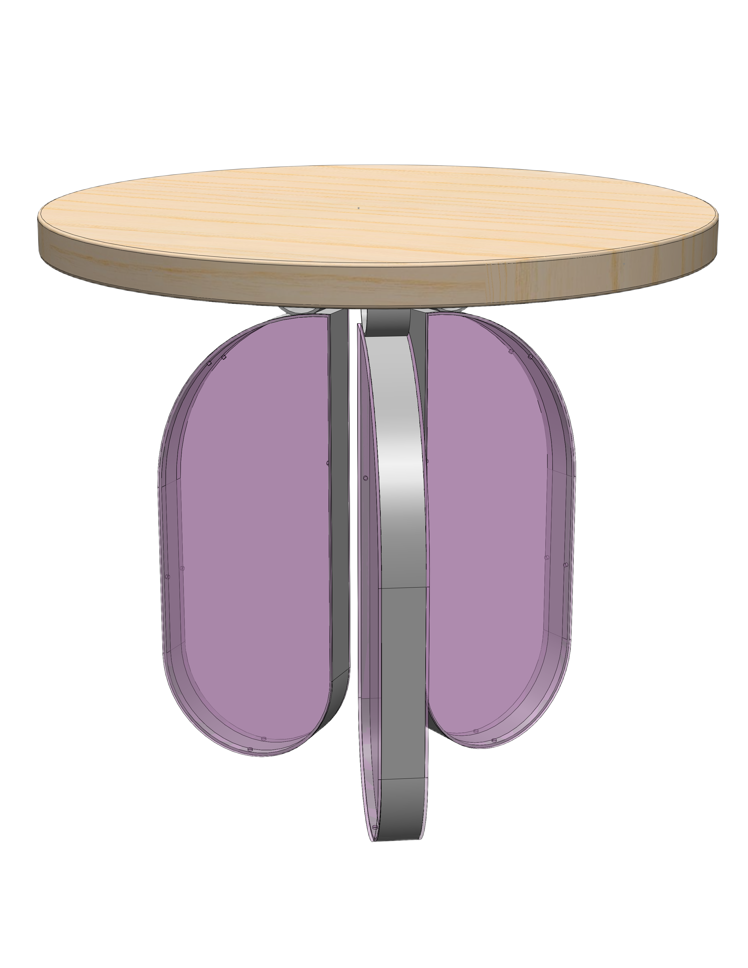
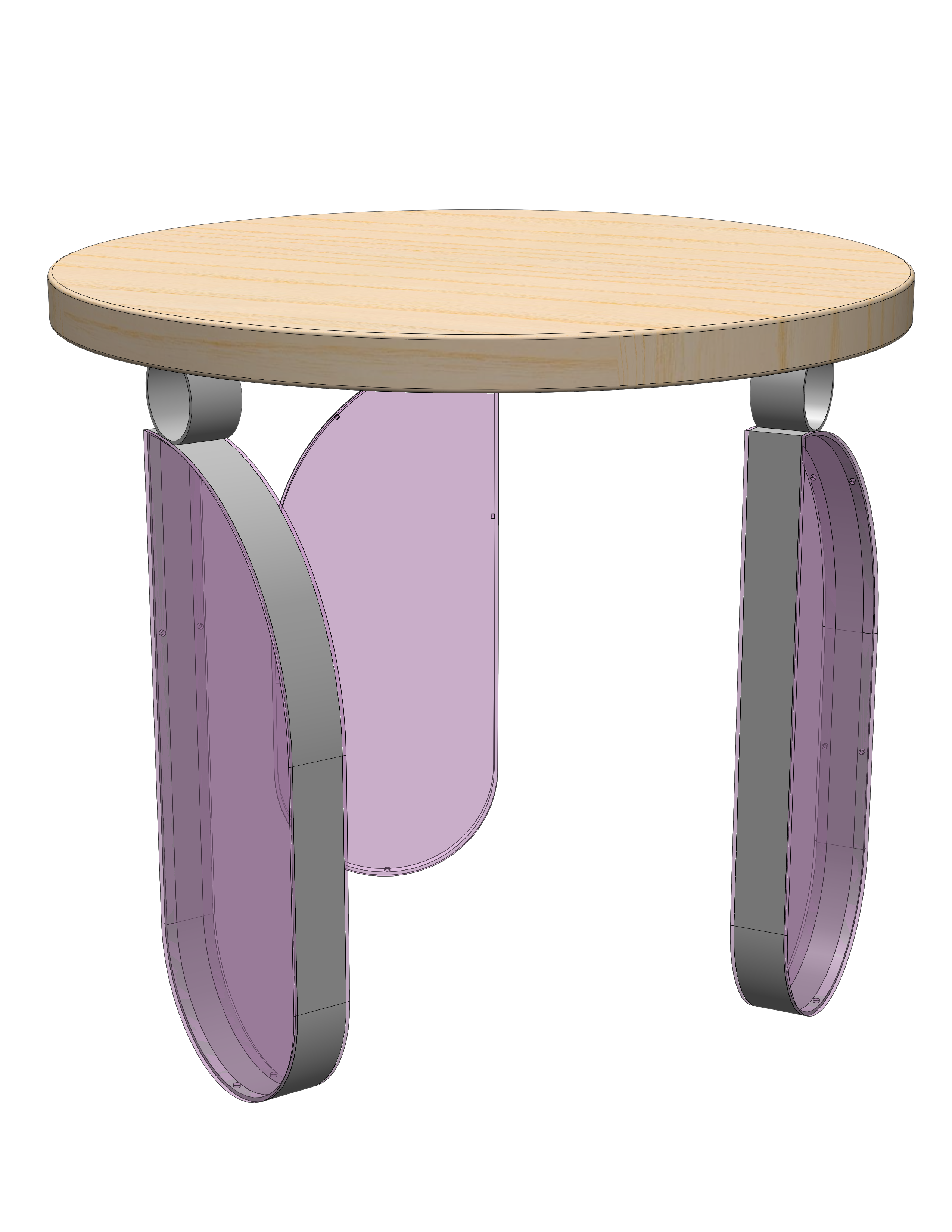
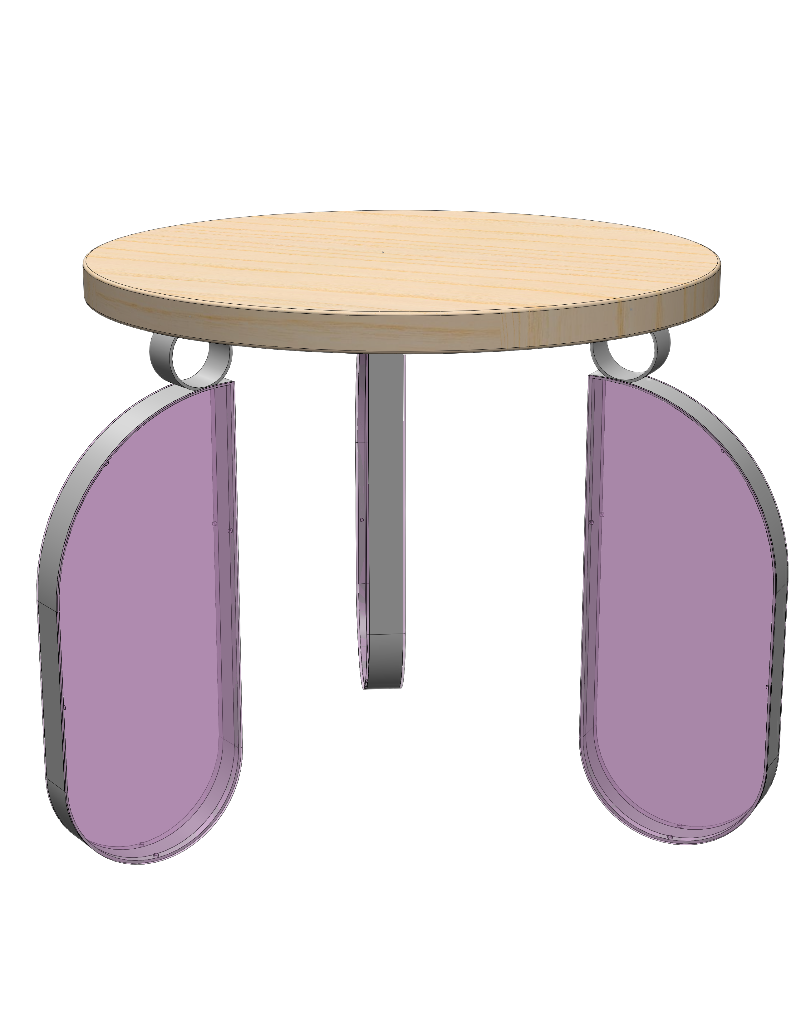
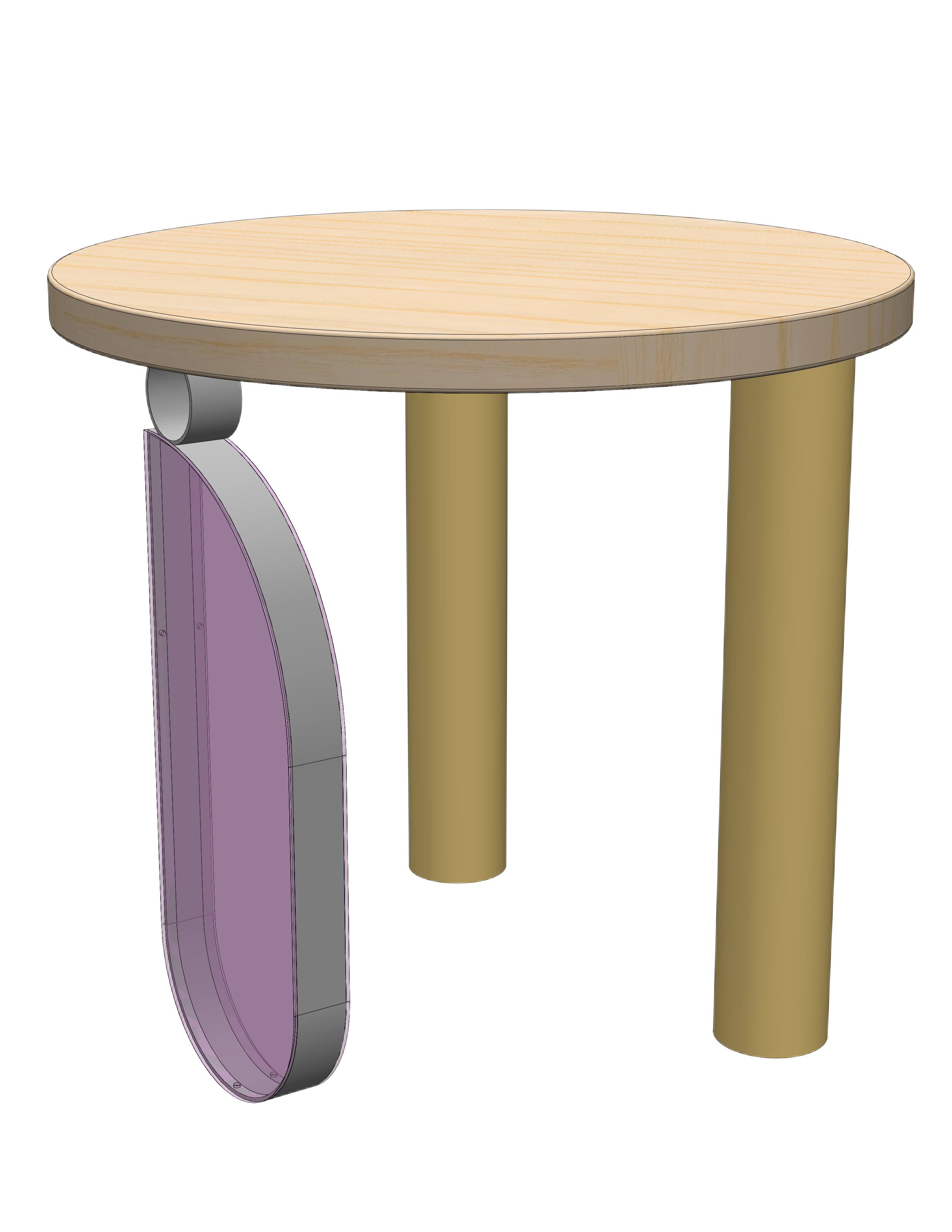
Mille Objects was a startup with a modular furniture concept where every component: legs, base, finish, etc can be mixed and matched. I led the UX design for their mobile configurator app. Mille Objects' furniture system is inherently complex. A single table can have a variable number of legs, each with independently configurable shape, material, height, position, rotation, and layered inserts. Multiply that across every component and the configuration space became enormous.
The challenge wasn't just designing an interface, but an overall decision structure and information architecture. How do you present that many options without overwhelming someone who just wants a nice table? And how do you prevent impractical configurations, such as a two-legged table that can't stand up?
Key Questions:
- How should the configuration flow be structured when every item has nested sub-options?
- What level of control do users actually want vs. what makes them anxious?
- How do you prevent impractical configurations without feeling restrictive?
Exploration & Wireframing
What are some potential interaction models?
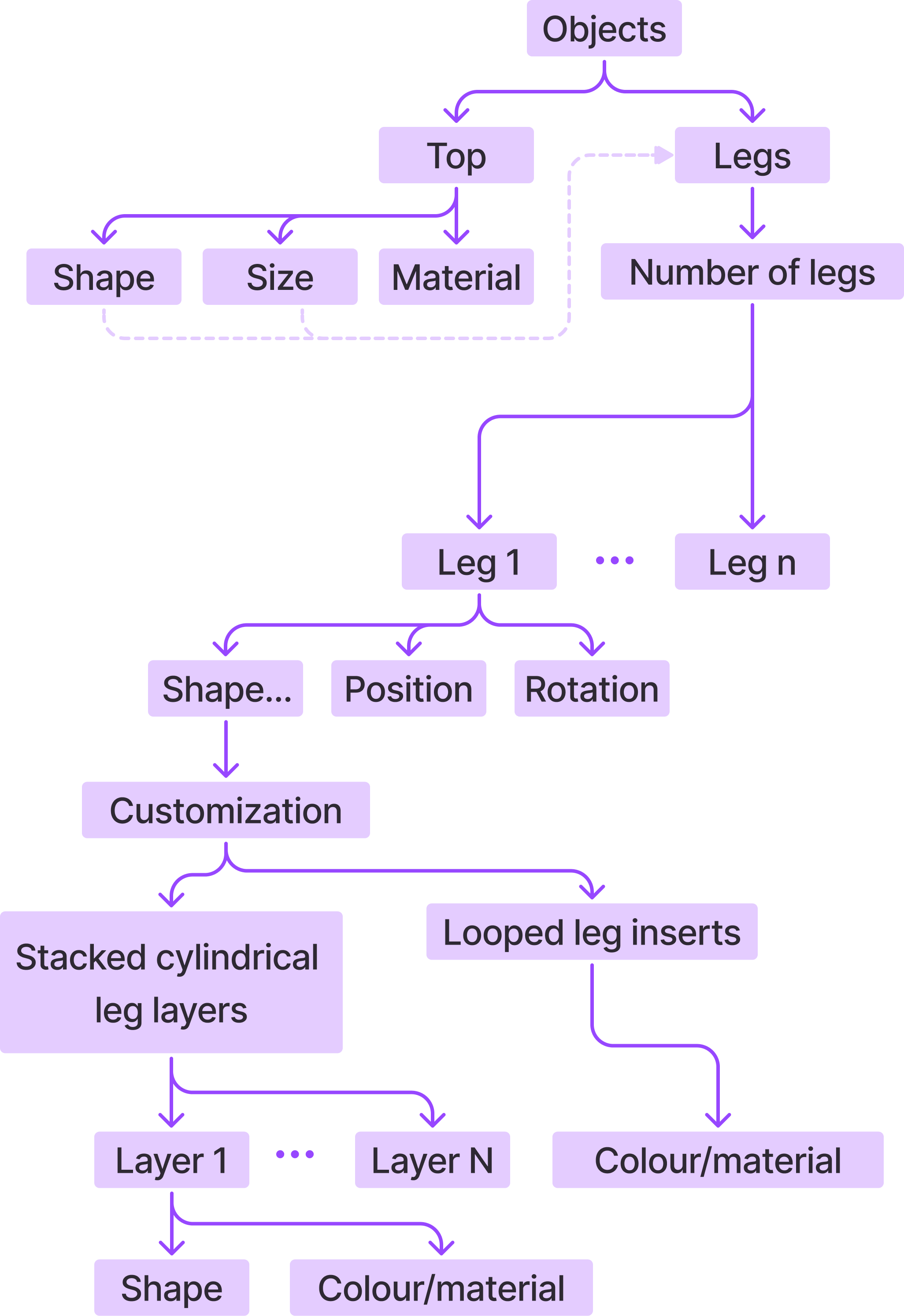
I started by mapping the information architecture of the product system: every configurable parameter, how they nested, and which depended on each other. From there, I brainstormed how the configuration flow could work on mobile, sketching how users might navigate between components and sub-components.

Top
Legs
Number of legs
Add-ons


1

2
2


Direct Manipulation
Users would drag, drop, and position components directly on a visual canvas. This gave maximum creative control but was complex to implement, required precise fine motor input on mobile, and didn't scale well.
Top
Legs
Add-ons
Leg 1 | Cylindrical

Base | Two layers
Number of legs
2
4
Height
Short
330mm
Tall
550mm
Customization

$200.00
Add to Cart
as configured


Reset


Nested Diagram
A visual diagram showed the full product structure, with tappable nodes for each component. This was comprehensive but made it unclear which element was currently selected, and packed too much information onto one screen.


Top
Legs
Add-ons

How many legs do you want?
Customize each leg
Leg 1
Leg 2

Leg 4
Leg 3

4


330mm
550mm

How tall do you want your table to be?
High-Level Only
Large, clear buttons for each major component (legs, base, top), with sub-options revealed after selection. The trade-off was less spatial context, but the interaction was far simpler and more accessible.
Usability Testing & Insights
Which interaction model did users find the most intuitive?
I tested these wireframe concepts with users to understand how they navigated the configurator and where they got stuck. Two findings shaped everything that followed.
Insights:
Too many options at once caused decision paralysis
Users were overwhelmed by the sheer number of nested options. Each component had several levels of customizability, and when everything was exposed at once, people didn't know where to start. The freedom that made the product exciting also made the experience paralyzing.
Users wanted the feeling of control more than actual control
Users loved the idea of near-unlimited customization, but they didn't necessarily want to make every decision themselves. They wanted to feel like they could customize everything, while being guided through a curated path that kept them from making bad choices.
User-centred design ≠ doing what users say they want.
Users said they wanted total control. But what they actually needed was confidence that their choices would result in something beautiful and functional. Users loved near-unlimited customization — but it also overwhelmed them and complicated decision-making.
Design Decisions
How do we create a flexible yet intuitive experience?
Leg 1

Customize
1
3
Number
Position


Height
Short
330mm
Finish


Top
$320.00
as configured
Components are split up into separate pages

Original stepper permitted impractical selections, like 2 legs

Constrained selection of leg numbers

Step-by-step flow
The final configurator guides users through a linear flow — select a top, configure each leg, choose a base — with the ability to dive deeper into any component. The interface prioritizes clarity: with one primary action per modal, and a visual preview of the table that updates as users make selections.
Leg numbers are constrained
Leg numbers for each table top shape were constrained with radio buttons, as opposed to letting users add/subtract legs one by one.
1
3
Number
Leg 1
Leg 2
Leg 3
Customize
Position
2
2
Height
Short
330mm
Tall
550mm
Finish
Top
$430.00
as configured
Pre-determined position options


1
1
2
Leg position options are limited
Leg position and rotation were also limited to a range of pre-determined position options, rather than letting users directly manipulate each individual leg. This ensured that possible leg configurations were also practical.
Shape
Full
Partial
Style
Transparent
Opaque

Pink

Purple

Blue

Pink
Purple
Blue
Insert

Leg 1

Finish
Top
$410.00
as configured

Leg features are nested into a submenu, and the display zooms into the selected leg
Nested features within each leg
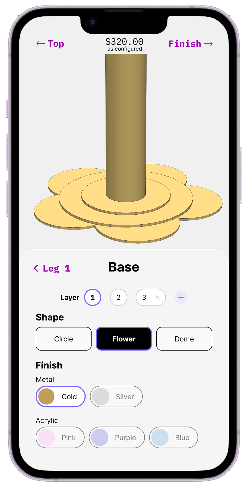
Rather than exposing every sub-option upfront, additional features (shape, material, finish, style) were tucked inside each leg's detail view. Users could go deep if they wanted, but the default path was clean and sequential.
Shape
Circle
Flower
Dome
Finish
Metal
Acrylic
Pink
Purple
Blue

Gold

Silver
Base
Leg 1
Layer
1
2
3


Finish
Top
$320.00
as configured
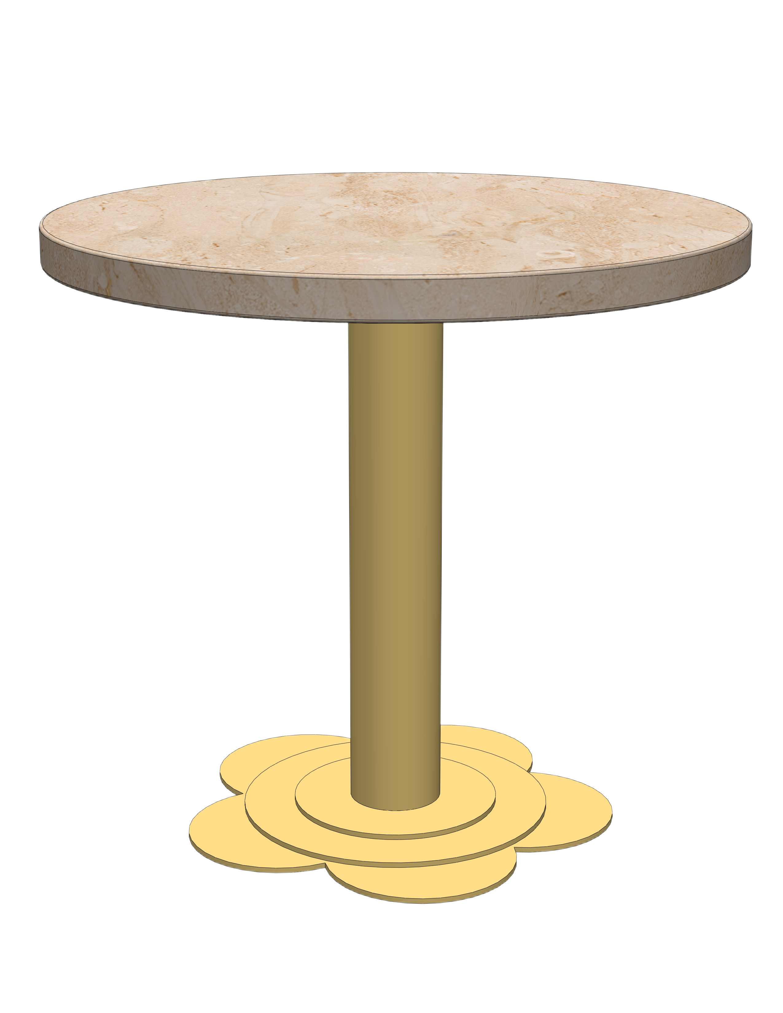

Base features are divided out into layers, each of which are customizable.
Stacked, customizable base
The base component system followed the same principle as the legs: options were present but organized so users encountered them progressively rather than all at once.
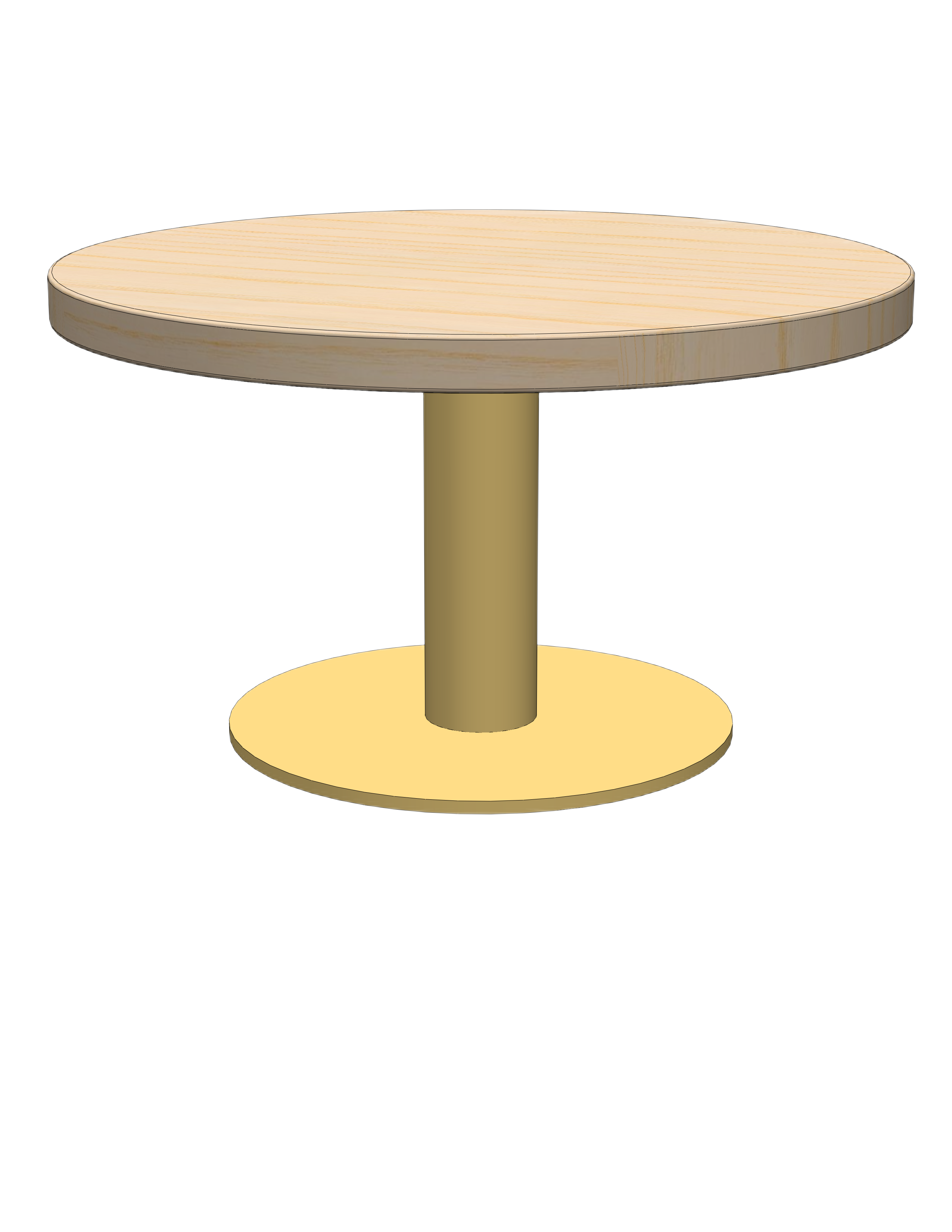
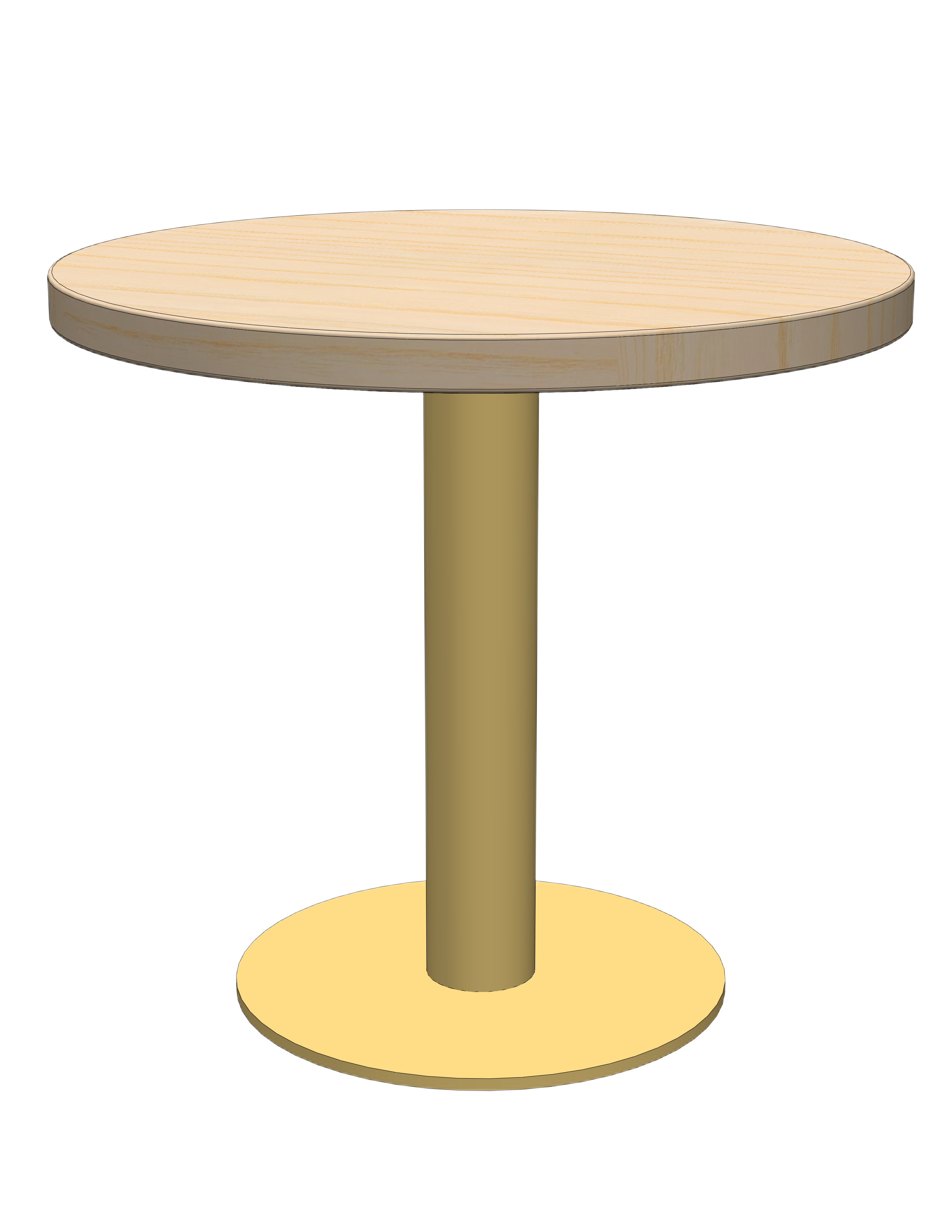
Outcome
The final configurator design
The finished configurator walks users through each component step by step — top, legs, and base — with a live 3D preview and running price total. Each screen focuses on one set of decisions at a time, and deeper customization options are nested within the user flow.
Reflections
What did I learn?
Constraints are an essential part of good design:
This project crystallized something I keep coming back to: the best customization experiences don't give users the most options. Instead, they give users the most confidence. Constraints aren't the enemy of personalization; they're what make personalization feel safe.
The shift from "let users do anything" to "guide users toward great outcomes" required letting go of the assumption that more control equals better UX. It also required close collaboration with the client to understand which configurations were actually feasible, so the constraints we designed weren't arbitrary. They reflected real structural and manufacturing logic..